Camila's Map Catolog
Sunday, October 10, 2010
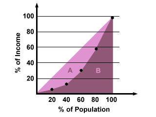
Accumulative line graph or Lorenz curve
http://www.google.com/imgres?imgurl=http://img.sparknotes.com/figures/D/df794916738a067d0a15bbaeabcb81e3/lorenz.gif&imgrefurl=http://www.sparknotes.com/economics/micro/incomedistribution/section1.rhtml&usg=__dClnB6ZjUWInoKIYLHN_B0WCp70=&h=240&w=320&sz=6&hl=en&start=7&zoom=1&um=1&itbs=1&tbnid=Tmr8fjGhZ1jl7M:&tbnh=89&tbnw=118&prev=/images%3Fq%3DAccumulative%2Bline%2Bgraph%2Bor%2BLorenz%2Bcurve%26um%3D1%26hl%3Den%26tbs%3Disch:1
This is an accumulative line graph that illustrates income distribution according to the population. These maps are usually used to show the probability of distribution of wealth.
No comments:
Post a Comment
Newer Post
Older Post
Home
Subscribe to:
Post Comments (Atom)
No comments:
Post a Comment