http://www.google.com/imgres?imgurl=http://www.eduplace.com/math/mhm/5/06a/ts_5_6a_wi-1.gif&imgrefurl=http://www.eduplace.com/math/mhm/5/06a/index.html&usg=__2ehQfQBpEn5_Elz1d1fNoam2NCc=&h=267&w=235&sz=5&hl=en&start=2&zoom=1&um=1&itbs=1&tbnid=uSXivEv81o_H6M:&tbnh=113&tbnw=99&prev=/images%3Fq%3DStem%2Band%2Bleaf%2Bplot%26um%3D1%26hl%3Den%26tbs%3Disch:1
A stem and leaf plot is similar to a histogrambeacuse it illustrates shape of a distribution. The left column represents the stems and the right column are the leaves.
Monday, October 11, 2010
Box plot
http://www.google.com/imgres?imgurl=http://www.itl.nist.gov/div898/handbook/eda/gif/boxplot0.gif&imgrefurl=http://www.itl.nist.gov/div898/handbook/eda/section3/boxplot.htm&h=280&w=380&sz=4&tbnid=BJGYdOoZjCD73M:&tbnh=91&tbnw=123&prev=/images%3Fq%3DBox%2BPlot&hl=en&usg=__N_-wNIpBJuG1Pith-M2ko3_XAko=&ei=Q6R3Svz7EZOCtgepm9CWCQ&sa=X&oi=image_result&resnum=4&ct=image
A box plot uses number summaries to depict numerical data. These maps also be used to indicate if there is any data that appears to be numerically distant fromt the rest of the data.
Sunday, October 10, 2010
Histogram
A histogram are used to depict the density of the data. This type of map must consist of tabular frequencies.
Parallel coordinate graph
http://www.google.com/imgres?imgurl=http://onlinecourses.science.psu.edu/stat857/sites/onlinecourses.science.psu.edu.stat857/files/lesson03/parallel_coord_graph.gif&imgrefurl=http://onlinecourses.science.psu.edu/stat857/book/export/html/4&usg=__waZJkIWsw7N52pP3dnl603OHb-g=&h=198&w=532&sz=47&hl=en&start=22&zoom=1&um=1&itbs=1&tbnid=2ruZNYXoBD7DWM:&tbnh=49&tbnw=132&prev=/images%3Fq%3DParallel%2Bcoordinate%2Bgraph%26start%3D20%26um%3D1%26hl%3Den%26sa%3DN%26ndsp%3D20%26tbs%3Disch:1
A parallel coordinate graph illustrates multivariate sets of data. This type of map can be useful when trying to find trends in the data.
Triangular plot
http://www.google.com/imgres?imgurl=http://www.ex-parrot.com/~chris/tmp/talk-2004-06-15/end-of-2003.png&imgrefurl=http://www.ex-parrot.com/~chris/wwwitter/20050407-it_doesnt_matter_how_you_vote_either_way_your_planet_is_doomed.html&usg=__fkRdvkEKCxDVQ8YzYKl_Ko-iH0c=&h=627&w=653&sz=41&hl=en&start=5&zoom=1&um=1&itbs=1&tbnid=Sf0A22Ny39_0iM:&tbnh=133&tbnw=138&prev=/images%3Fq%3DTriangular%2Bplot%26um%3D1%26hl%3Den%26sa%3DN%26tbs%3Disch:1
This map illustrates three sets of data; the liberal democratic vote, labour vote as well as the conservative vote. Triangular plot maps are useful because comparisons can be made easily.
Windrose
http://www.google.com/imgres?imgurl=http://upload.wikimedia.org/wikipedia/commons/thumb/b/bb/Windrose.svg/600px-Windrose.svg.png&imgrefurl=http://en.wikipedia.org/wiki/Commons:File:Windrose.svg&usg=__6mWLxGBP3VdPnKNXqQgITIAv0pw=&h=600&w=600&sz=44&hl=en&start=2&zoom=1&um=1&itbs=1&tbnid=V2TzdzlmHd2BqM:&tbnh=135&tbnw=135&prev=/images%3Fq%3Dwindrose%26um%3D1%26hl%3Den%26tbs%3Disch:1
A windrose is used to determine the speed and direction of wind. Windroses have been used in maps for quite some time and they were developed long before the compass rose.
Climograph
http://www.google.com/imgres?imgurl=http://www.uwsp.edu/geo/faculty/ritter/images/atmosphere/climate/climographs/memphis.jpg&imgrefurl=http://www.uwsp.edu/geo/faculty/ritter/glossary/A_D/climograph.html&usg=__sOJoBZyN7QL2AMuSFcKdI_is7Zc=&h=240&w=333&sz=15&hl=en&start=3&zoom=1&um=1&itbs=1&tbnid=vXmic3FK4bSO9M:&tbnh=86&tbnw=119&prev=/images%3Fq%3DClimograph%26um%3D1%26hl%3Den%26tbs%3Disch:1 This map illustrates the amount of rainfall and temperature for Memphis, Tennessee. Climographs illustrate precipation by using a bar graph and temperature is depicted by using a line graph.
Population profile
http://www.google.com/imgres?imgurl=http://www.ifad.org/operations/regional/pf/figure1.gif&imgrefurl=http://www.ifad.org/operations/regional/pf/aids_1.htm&usg=__T9NIj9Ua-EqX2y0qr_tpYFzeptM=&h=365&w=533&sz=7&hl=en&start=1&zoom=1&um=1&itbs=1&tbnid=1A_xvum0F1zaWM:&tbnh=90&tbnw=132&prev=/images%3Fq%3DPopulation%2Bprofile%26um%3D1%26hl%3Den%26sa%3DG%26tbs%3Disch:1
This is a population profile map that illustrates the amount of people that have AIDS according to their age and gender. These maps are commonly used to depict stastics of a population over a given amount of time.
Scatterplot
A scatterplot maps is used to depict a set of data that uses two variables. This map illustrates the mean annual temperature of the state of Nevada.
Index value plot
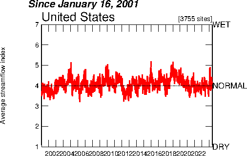
http://waterwatch.usgs.gov/?m=pa07d&w=plot
This is an index value plot map that illustrates the steamflow from 2001 to present in the United States. In this type of maps index values are used instead of actual numbers.
Accumulative line graph or Lorenz curve
http://www.google.com/imgres?imgurl=http://img.sparknotes.com/figures/D/df794916738a067d0a15bbaeabcb81e3/lorenz.gif&imgrefurl=http://www.sparknotes.com/economics/micro/incomedistribution/section1.rhtml&usg=__dClnB6ZjUWInoKIYLHN_B0WCp70=&h=240&w=320&sz=6&hl=en&start=7&zoom=1&um=1&itbs=1&tbnid=Tmr8fjGhZ1jl7M:&tbnh=89&tbnw=118&prev=/images%3Fq%3DAccumulative%2Bline%2Bgraph%2Bor%2BLorenz%2Bcurve%26um%3D1%26hl%3Den%26tbs%3Disch:1
This is an accumulative line graph that illustrates income distribution according to the population. These maps are usually used to show the probability of distribution of wealth.
Bilateral graph
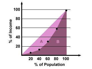
A bilateral graph or map shows two variables and are usually very easy to read because it illustrates both positive and negative values.This map illustrates the state of California's mortgage rate trends.
Nominal area choropleth map
Unstandardized choropleth map
http://www.google.com/imgres?imgurl=https://blogger.googleusercontent.com/img/b/R29vZ2xl/AVvXsEgneqQT-vNr39z_9tX-KaEyB8WcaENs0NawsZhMwp6xSZJdqU-39ats80S4sbmZiOxQ1VGLHVzDMn_HdSTUAzrkQzs4BQMAikAHUQrBT-Fmc0ZtXxqOKgySHI5c5Qxg9NEzQ5xyldEZkc4/s1600/unstan.jpg&imgrefurl=http://similaritymatrix.blogspot.com/2009/11/unstandardized-choropleth-map.html&usg=__4P-z7wcuDcGFLPK1CaC3xcXqQiU=&h=275&w=474&sz=18&hl=en&start=10&zoom=1&um=1&itbs=1&tbnid=e0S--DJVgxB1-M:&tbnh=75&tbnw=129&prev=/images%3Fq%3Dunstandardized%2Bchoropleth%2Bmaps%26um%3D1%26hl%3Den%26tbs%3Disch:1 This is an unstandardized choropleth map of the world's fertility rate. Unstandardized maps are maps which are not areally averaged.
Standardized choropleth map
http://www.google.com/imgres?imgurl=http://www.statcan.gc.ca/pub/92f0138m/2008003/figures/figure3.1-en.jpg&imgrefurl=http://www.statcan.gc.ca/pub/92f0138m/2008003/figures/5200001-eng.htm&usg=__LwfMIXP6xqMcKs73DRmozwwQX3g=&h=620&w=850&sz=318&hl=en&start=1&zoom=1&um=1&itbs=1&tbnid=CVFlvJdZBdf_YM:&tbnh=106&tbnw=145&prev=/images%3Fq%3DStandardized%2Bchoropleth%2Bmaps%26um%3D1%26hl%3Den%26sa%3DG%26tbs%3Disch:1 This is a standardized choropleth map of Canada illustrates the population of citizens fourteen and under with the use of color. A standardized choropleth map is useful because it allows the comparison of distribution across areas.
Univariate choropleth map
http://www.google.com/imgres?imgurl=https://blogger.googleusercontent.com/img/b/R29vZ2xl/AVvXsEgFasPDDMXL3z8B9Ho6S8fG3reeGri1MojNWhc_JnbVECUB2RIngJ7J3HnGXHb6J1CfWnQr4PmxDLDas_0w-t4vH5Vx0iEeNogIGt6HPi7-UIsE-PM5c5F2bxNT5AGQEZWuSjOMdLuz2-c/s400/Choropleth.gif&imgrefurl=http://mapcollection2009.blogspot.com/&usg=__Q7Q5sw8SMfZUKz9WhCYR66VJa4c=&h=250&w=400&sz=131&hl=en&start=12&zoom=1&um=1&itbs=1&tbnid=mL6h22I7MgpoVM:&tbnh=78&tbnw=124&prev=/images%3Fq%3DUnivariate%2Bchoropleth%2Bmap%26um%3D1%26hl%3Den%26sa%3DN%26tbs%3Disch:1
This is an univariate choropleth map of the United States which displays water usage throughout the country. An univariate choropleth map displays only on set of data as can be seen in this particular map.
Thursday, October 7, 2010
Bivariate choropleth map
http://www.google.com.pe/imgres?imgurl=https://blogger.googleusercontent.com/img/b/R29vZ2xl/AVvXsEhBO6JncqoUc9sc_cjYQkUz_kgMub2xJCpjwr9hFB1dlO_pGCh3poDNWuVl71SMViSg-8QCJfy1XM6rJpTpNV8UsWNB4TgvlKrm9WWJoL2JoUkEy0Zq5kgGM6iJDUHqSFe_4zYDhAjdjCmR/s400/changeanim.gif&imgrefurl=http://worldofmaps101.blogspot.com/2008_07_01_archive.html&usg=__E_sd2lXyvV1l8sPI2j_AVTTPw2I=&h=309&w=400&sz=135&hl=es&start=24&zoom=1&um=1&itbs=1&tbnid=-Obr_KyilOAqWM:&tbnh=96&tbnw=124&prev=/images%3Fq%3DBivariate%2Bchoropleth%2Bmaps%26start%3D20%26um%3D1%26hl%3Des%26sa%3DN%26ndsp%3D20%26tbs%3Disch:1
This is a brivate choropleth map of the divorce rate in the United States. These types of maps are used to identify two variables with the use of color.
Unclassed choropleth maps
http://www.google.com.pe/imgres?imgurl=https://blogger.googleusercontent.com/img/b/R29vZ2xl/AVvXsEgFf0gtNsq6QZMXNcQ0lV7EFJCI8f6T8KzieBBmRFLknUNcNkNnJsGX5TL-bSDfXGPdXfxao1Xzt6l7K5OVb3XAMe4FCmqsmbv8Y1gSlQqn57iiYTo9oexRZRHjl05q8fTIxsth4NLkzPw/s320/unclass+choropleth.gif&imgrefurl=http://mavance2000.blogspot.com/2008/06/unclassed-choropleth-map.html&usg=__eYl7CQi4WsBMDfxNOkDPSlNdMWk=&h=204&w=320&sz=96&hl=es&start=17&zoom=1&um=1&itbs=1&tbnid=lqP1wnqAFLQMVM:&tbnh=75&tbnw=118&prev=/images%3Fq%3DUnclassed%2Bchoropleth%2Bmaps%26um%3D1%26hl%3Des%26ndsp%3D20%26tbs%3Disch:1
Unclassed choropleth maps are not widely accepted, because they do not classify the data. This map illustrates the fertility rate for women in Europe.
Classed choropleth map
http://www.google.com.pe/imgres?imgurl=https://blogger.googleusercontent.com/img/b/R29vZ2xl/AVvXsEh4GxI4MUkZmOMpkWZU2AI8Udnl-_M9T_8OyvnUGB1Z6fzVOnDTbD5PQYBWXxKrhU8J6XrwSpei0G2CssXVEBePs9bALr1PK63nqLax1sWFOjqDanV-vqPxJ09fs02gFr2ZvP_9kcKw8Fk/s320/32-+Classed+choropleth+maps.png&imgrefurl=http://tomsmapcatalog.blogspot.com/2010_04_01_archive.html&usg=__oRCP0fBiuJR2O19NSnPO1gV_eLY=&h=193&w=280&sz=29&hl=es&start=20&zoom=1&um=1&itbs=1&tbnid=-YHYtTWD_LXpAM:&tbnh=79&tbnw=114&prev=/images%3Fq%3DClassed%2Bchoropleth%2Bmaps%26um%3D1%26hl%3Des%26ndsp%3D20%26tbs%3Disch:1
A choropleth map is very easy to read, the colors are proportional to what is being measured in the legend. This map in specific measures the victories for either George Bush or John Kerry during the 2004 presidential elections.
Range graded proportional circle map
http://www.google.com.pe/imgres?imgurl=http://www.nature.com/nature/journal/v451/n7181/images/nature06536-f2.2.jpg&imgrefurl=http://mikehaleysmaps.blogspot.com/&usg=__FIxmTJwSe8At6D8dSTQU6bQ8R8s=&h=428&w=800&sz=254&hl=es&start=4&zoom=1&um=1&itbs=1&tbnid=FNwhs12ezNClIM:&tbnh=77&tbnw=143&prev=/images%3Fq%3DRange%2Bgraded%2Bproportional%2Bcircle%2Bmap%26um%3D1%26hl%3Des%26ndsp%3D20%26tbs%3Disch:1
This is a range graded proportional circle map that illustrates the number of EID events in the world. We can see that most events occur in Europe and in the United States.
Wednesday, October 6, 2010
Continuously variable proportional circle map
http://mapanalysisnoles949.blogspot.com/2008/06/continuously-variable-proportional.html
A continuously variable proportional circle map uses circles to indicate data. Each circle in the map is equivalent to a specific amount of data that is being measured.
DOQQ
http://www.google.com.pe/imgres?imgurl=https://blogger.googleusercontent.com/img/b/R29vZ2xl/AVvXsEjAZVwjCWWvhuepIM8bISJK9JZlDruJ3l_OfLg2tYXceMzewcrAVJ1QAR-skNbH4ZIJZkhKmqMgvCjgMGxVSValw5YvgBTPg5HWl_b8WTwNHcifah4mAyEYYI9ezNSJIVEUwkrIiEXzz7k/s1600/29-+DOQQ.jpg&imgrefurl=http://tomsmapcatalog.blogspot.com/2010_04_01_archive.html&usg=__39OfrbRxfEsE-CG7GPt2FsKYrow=&h=468&w=417&sz=40&hl=es&start=1&zoom=1&um=1&itbs=1&tbnid=Bho1iHloAINLeM:&tbnh=128&tbnw=114&prev=/images%3Fq%3DDOQQ%26um%3D1%26hl%3Des%26ndsp%3D20%26tbs%3Disch:1
A DOQQ is a color photograph made from an airplane. This type of photographs captures infrared light, each block of light that is seen in the pictures measures about three feet in real life.
DEM
DLG
http://www.google.com.pe/imgres?imgurl=http://ga.water.usgs.gov/olympics/columbus.dlg.gif&imgrefurl=http://cprellezo.blogspot.com/&usg=__fH-R_mbdzQPjv5Lga_rc5Jfnvsg=&h=436&w=456&sz=22&hl=es&start=2&zoom=1&um=1&itbs=1&tbnid=pHEIHLgwEhsHRM:&tbnh=122&tbnw=128&prev=/images%3Fq%3DDLG%2Bmap%26um%3D1%26hl%3Des%26tbs%3Disch:1
A Digital Line Graph (DLG) is map that is helpful in the study of the Earth's surface. This is an image that represents a partial part of the state of Georgia.
DRG
http://www.google.com.pe/imgres?imgurl=http://www.tceq.state.tx.us/assets/public/gis/images/drg.gif&imgrefurl=http://www.tceq.state.tx.us/gis/drg.html&usg=__qxjL45cP4iIaG2I7U_tRa1wO3Vs=&h=556&w=607&sz=97&hl=es&start=3&zoom=1&um=1&itbs=1&tbnid=XTr5fV2kfCeExM:&tbnh=125&tbnw=136&prev=/images%3Fq%3DDRG%26um%3D1%26hl%3Des%26tbs%3Disch:1
A scanned image of the Geological Survey topographic map is called a DGR, this is an image of the Colorado river area. They are normally used to study the Earth's surface.
Isopleths
http://www.google.com.pe/imgres?imgurl=https://blogger.googleusercontent.com/img/b/R29vZ2xl/AVvXsEj5VrUsnse-7GaTzSS2sRooBf6mRdMT40y2d3_ZMMW_1Og_54TE5W4UFuwP4-OODs7jmSplj7nJtpCcPnAY4mv01FBa-G088qbVaJ4Jil7KV-ge2oio_IzGd6U-c_ACaCLo0Nb9bnkhrF9N/s400/isopleths.gif&imgrefurl=http://gmat505.blogspot.com/2010_04_01_archive.html&usg=__nrSVysom9zNHr2jXFE2zVSANS_k=&h=307&w=400&sz=149&hl=es&start=2&zoom=1&um=1&itbs=1&tbnid=LB3-6T1SE6b9AM:&tbnh=95&tbnw=124&prev=/images%3Fq%3DIsopleths%26um%3D1%26hl%3Des%26sa%3DN%26tbs%3Disch:1
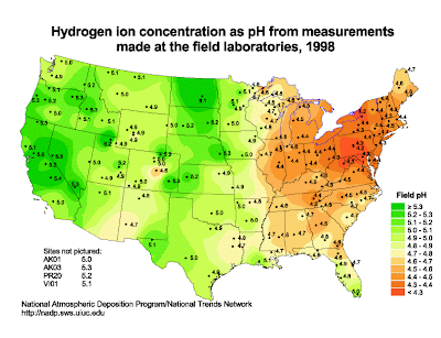
This is an isopleth map of the United States that illustrtates the amount of pH in the country. An isopleth is a contour line that illustrates a variable that cannot be measured at any give point. In this map, we can see that different colors are used to illustrate the amount of pH
Tuesday, October 5, 2010
Isopach
This is an isopach map that uses different colors to illustrate the amount of overburden sediment on the ocean floor. The different colors helps illustrate the thickness of the sediment.
Isohyets
This is an isohyet map that shows the amount of percipitation. An isohyet is a line that connects two places that receive the same amount of rainfall.
Isotach
This is a map showing the weather forecast with isotachs. It displays the wind speeds, this map shows that there will be a severe thunderstorm.
Isobars

This is a map that illustrates isobars in Europe. They are used to show high and low pressure fronts.
LIDAR
This is a LIDAR three dimensional model of the city of New York after the terrorist attacks of September 11th, 2001. This was used in order to calculate how the smoke affected different parts of the city.
Doppler radar map

This is a doppler radar map that illustrates a hurricane that was about to hit the state of Florida. Meteorologists use doppler radars to predict the weather forecast.
Black and white aerial photo
This is a black and white aerial photo of the downtown in the city of Johnstown, Pennsylvania. It is part of a set of photos that shows how they rebuilt this city.
Sunday, October 3, 2010
Infrared aerial photo
This is an infrared picture of South Florida. This photo was used in a study case done for the Everglades National park.
Cartographic animation map

This a standstill animated cartographic map of the world that illustrates the air temperature from 1959-1997. Animated maps helps us get a better understanding of the data rather than having to compare through several maps.
Statistical map
This is a statistical map of the United States that depicts each state as either Republican or Democratic. It illustrates the tendency that each state had to vote for either McCain or Obama during the 2008 elections.
Cartogram
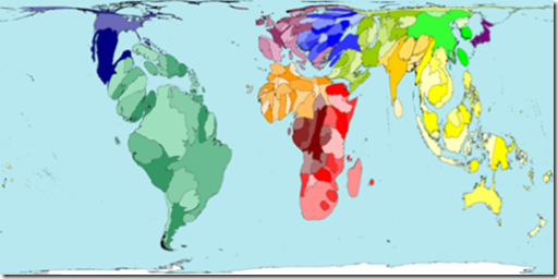
This is a cartogram of the world according to plant population. We can clearly see that the world is distorted in order to make each country proportional to the number of plant species it has.
Flow map
This is a flow map of different countries in Europe. It depicts the telecommunications traffic flow using red curved lines. The thickness of each line is equal to the amount of traffic.
Isoline map

This is an isoline map of China. It depicts the water flow of different areas in China.
Proportional circle map

This is a proportional circle map of Canada, it shows the population of the provinces and territories of this country. One can use the legend in order to see what the size of the circle represents.
Choropleth map
This is a choropleth map of Florida which shows the percentage of Hispanics. This map is divided by counties and data classes.
Dot distribution map
This is a dot distribution map of the world. It shows the distribution of duckweed, it helps us know what countries have a greater abundance of duckweed.
Propaganda map
This is a propaganda map that shows the intentions of the Nazi party 1957. It tries to persuade the reader Nazi's were trying to take over.
Hypsometric map

This is a hypsometric map of the United States. It shows terrain with colors and shading.
PLSS map
http://www.nationalatlas.gov/articles/boundaries/a_plss.html
This is a PLSS map of the states that are included. The Public Land Survey System (PLSS) subdivides and describes the land.
Cadastral map
http://www.google.com.pe/imgres?imgurl=http://www.icsm.gov.au/mapping/images/isis_topo_cadastral.jpg&imgrefurl=http://www.icsm.gov.au/mapping/maps_cadastral.html&usg=__FFZoVtFPYn5OsJ-PIEd2vOrpL8I=&h=3107&w=3107&sz=6413&hl=es&start=5&zoom=1&um=1&itbs=1&tbnid=KGsxA6Yb5ghYeM:&tbnh=150&tbnw=150&prev=/images%3Fq%3DCadastral%2Bmaps%26um%3D1%26hl%3Des%26sa%3DG%26ndsp%3D20%26tbs%3Disch:1
This is a cadastal map of a certain part of a city. It shows ownership and boundaries as well as precise location.
Thematic map
http://www.google.com.pe/imgres?imgurl=http://www.epa.gov/oppt/rsei/images/thematic.jpg&imgrefurl=http://www.epa.gov/oppt/rsei/pubs/demo_maps.html&usg=__O6nun1p-xLpH9v76b3SbVlkPxuQ=&h=345&w=500&sz=33&hl=es&start=4&zoom=1&um=1&itbs=1&tbnid=rQ67xtMvc9e3MM:&tbnh=90&tbnw=130&prev=/images%3Fq%3DThematic%2Bmaps%26um%3D1%26hl%3Des%26ndsp%3D20%26tbs%3Disch:1
This is a thematic map of the United States and the distribution of risk indicators of the environment throughout states. It uses colors to indicate which states are at bigger risk than others.
Topographic Map
This is a topographic map of South America concentrated on Brazil. It clearly shows man made and natural resources. It also shows us elevation with the use of contour lines
Planimetric map
http://www.google.com.pe/imgres?imgurl=http://egsc.usgs.gov/nimamaps/graphics/K341SIraqRefgra_th.jpg&imgrefurl=http://egsc.usgs.gov/nimamaps/topo.html&usg=__GmIY3bZKkCgLa1vfPQgKEaodjyY=&h=338&w=312&sz=51&hl=es&start=6&zoom=1&um=1&itbs=1&tbnid=Q_2BiY2258epBM:&tbnh=119&tbnw=110&prev=/images%3Fq%3DPlanimetric%2Bmap%26um%3D1%26hl%3Des%26tbs%3Disch:1
This is a planimetric map of Iraq and its surrounding countries. It is planimetric because it only shows the horizontal features of this country.
Mental map

This is a mental map of how a person perceives New York to be like. As we can see it is very clustered and there is even a camel which adds to the name given at the bottom "New Yorkistan".
Subscribe to:
Posts (Atom)