Camila's Map Catolog
Sunday, December 5, 2010
Star Plots
http://www.google.com.pe/imgres?imgurl=http://www.itl.nist.gov/div898/handbook/eda/section3/gif/starplot.gif&imgrefurl=http://www.itl.nist.gov/div898/handbook/eda/section3/starplot.htm&usg=__brRSSJMv9BmxEcBW7Lip5DAHakA=&h=280&w=380&sz=4&hl=es&start=2&zoom=1&um=1&itbs=1&tbnid=Zy5ubhyj-artSM:&tbnh=91&tbnw=123&prev=/images%3Fq%3DStar%2Bplots%26um%3D1%26hl%3Des%26ndsp%3D20%26tbs%3Disch:1
The image above illustrates a variety of different star plots that can be used to depict information a 1979 autombile analysis. These star plots can also be used to idenitfy cars with similar features.
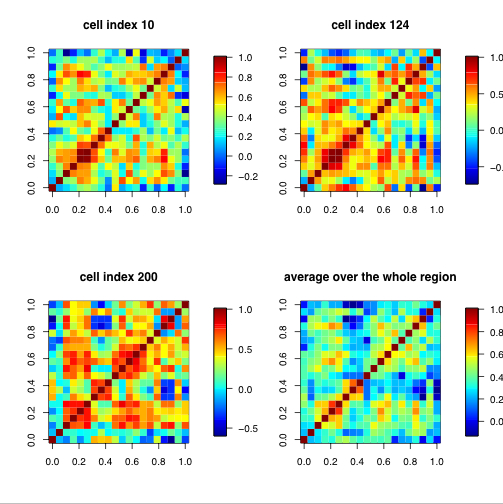
Correlation Matrix
http://www.google.com.pe/imgres?imgurl=http://www.image.ucar.edu/GSP/Projects/JunIPCCModelBiasCorrelations.jpg&imgrefurl=http://www.image.ucar.edu/GSP/Projects/ResearchNuggets.shtml&usg=__sl91IxoAOETxOezdmOKOwILNTYU=&h=504&w=503&sz=279&hl=es&start=10&zoom=1&um=1&itbs=1&tbnid=e9Jxv4ZDW7jWlM:&tbnh=130&tbnw=130&prev=/images%3Fq%3Dcorrelation%2Bmatrix%26um%3D1%26hl%3Des%26sa%3DN%26ndsp%3D20%26tbs%3Disch:1
The map above is a correlation matrix and these types of maps depict how well things correlate. In these specific maps the data shown illustrates climate model biases.
Similarity matrix
http://tomcat.esat.kuleuven.be/txtgate/tutorial.jsp
A similarity matrix allows the map viewer to see where two sets of data intersect. This map uses a variety of colors to indicate different genes.
Monday, October 11, 2010
Stem and leaf plot
http://www.google.com/imgres?imgurl=http://www.eduplace.com/math/mhm/5/06a/ts_5_6a_wi-1.gif&imgrefurl=http://www.eduplace.com/math/mhm/5/06a/index.html&usg=__2ehQfQBpEn5_Elz1d1fNoam2NCc=&h=267&w=235&sz=5&hl=en&start=2&zoom=1&um=1&itbs=1&tbnid=uSXivEv81o_H6M:&tbnh=113&tbnw=99&prev=/images%3Fq%3DStem%2Band%2Bleaf%2Bplot%26um%3D1%26hl%3Den%26tbs%3Disch:1
A stem and leaf plot is similar to a histogrambeacuse it illustrates shape of a distribution. The left column represents the stems and the right column are the leaves.
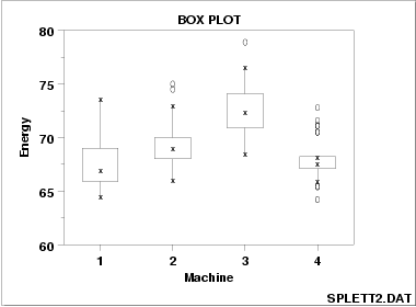
Box plot
http://www.google.com/imgres?imgurl=http://www.itl.nist.gov/div898/handbook/eda/gif/boxplot0.gif&imgrefurl=http://www.itl.nist.gov/div898/handbook/eda/section3/boxplot.htm&h=280&w=380&sz=4&tbnid=BJGYdOoZjCD73M:&tbnh=91&tbnw=123&prev=/images%3Fq%3DBox%2BPlot&hl=en&usg=__N_-wNIpBJuG1Pith-M2ko3_XAko=&ei=Q6R3Svz7EZOCtgepm9CWCQ&sa=X&oi=image_result&resnum=4&ct=image
A box plot uses number summaries to depict numerical data. These maps also be used to indicate if there is any data that appears to be numerically distant fromt the rest of the data.
Sunday, October 10, 2010
Histogram
http://www.google.com/imgres?imgurl=http://www2.mar.dfo-mpo.gc.ca/science/acon/Examples/HistogramExample.gif&imgrefurl=http://www2.mar.dfo-mpo.gc.ca/science/acon/Examples/HistogramExample.html&usg=__-UIjnVuqNrKJ3Z3HTOfu4keM2mk=&h=289&w=337&sz=4&hl=en&start=1&zoom=1&um=1&itbs=1&tbnid=9QX0VmxDIhxODM:&tbnh=102&tbnw=119&prev=/images%3Fq%3DHistogram%26um%3D1%26hl%3Den%26tbs%3Disch:1
A histogram are used to depict the density of the data. This type of map must consist of tabular frequencies.
Parallel coordinate graph
http://www.google.com/imgres?imgurl=http://onlinecourses.science.psu.edu/stat857/sites/onlinecourses.science.psu.edu.stat857/files/lesson03/parallel_coord_graph.gif&imgrefurl=http://onlinecourses.science.psu.edu/stat857/book/export/html/4&usg=__waZJkIWsw7N52pP3dnl603OHb-g=&h=198&w=532&sz=47&hl=en&start=22&zoom=1&um=1&itbs=1&tbnid=2ruZNYXoBD7DWM:&tbnh=49&tbnw=132&prev=/images%3Fq%3DParallel%2Bcoordinate%2Bgraph%26start%3D20%26um%3D1%26hl%3Den%26sa%3DN%26ndsp%3D20%26tbs%3Disch:1
A parallel coordinate graph illustrates multivariate sets of data. This type of map can be useful when trying to find trends in the data.
Older Posts
Home
Subscribe to:
Comments (Atom)


